Linga Restaurant Operating System Feature Request Forum

 Reporting - Ability to break out customer by items
Reporting enhancement - customer would like to be able to see "Who purchased the most 'Y' last week?". Currently, today, there is not a clean way to get this information.

customer "paid amount" and "return-change" details
In the back office, under Reports->Transactions-->Filter by Tender Name: "Cash" and open any cash transaction form the list:
I am not able to see customer paid amount and also return change amount in that cash transaction, which gives me hard time finding the difference in cash amount when closing the till. I cant go to the store physically to check how much customer paid the amount and how much the store has return cash change to customer.
Please add those 2 fields in the back office in the given spot, this is very much needed in back office.

Drag and Drop pictures when adding picture to the item.
Hi!
Could you please add a "Drag and Drop" feature to easier adding pictures to Products/Items?

Enterprise Comparison Report
Add the existing Store Comparison Report as an Enterprise report. Currently, there is no good way to do a comparison report by date across existing stores.

Taxes - Fatt Punditt
We want to be able to disable taxes from printing on customer receipt even thou they pay taxes (UK) (Too much confusion for customers & rather make taxes invisible)

auto fee option
an automatic fee should be able to charge on to go option. not showing under tax report.

Add UPC Code option in Menu Item Sales Report
in addition to Sales Amount, Quantity , Tax, Discount, % of Sales and Price Level.

Enhancement
- Login with Arabic + English -- It is an enhancement
-->Spoke to the customer, he informed after sign with the credentials he wants all the menu items should be shown both in English and Arabic. As of now, it's showing only in Arabic.
2- The order cancellation option needs to be active --> It is an enhancement.-->Need an option to cancel the order in online ordering after placing the order.

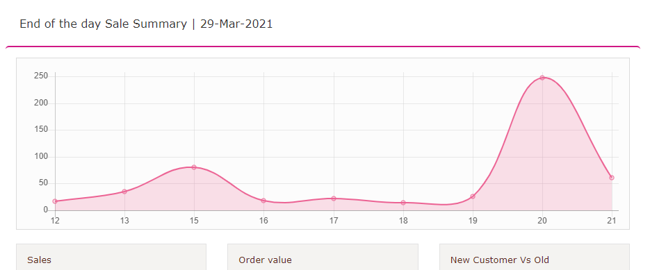
Add labels to the graph on the Daily KPI report
The Daily KPI report link that can be auto-emailed does not label the graph at the top. Comparing it to other reports, I confirmed it is a net sales by hour report.
It would be helpful to label the axes of the graph as Hour (X axis) & Net Sales (Y axis) to make that clear to users.
It would also be nice to give the viewer the option of 12-hour vs 24-hour for the X axis. So 20 becomes 8pm.

Customer support service by UserEcho